Debate Grows Over Board of Peace Logo After Davos Unveiling

Introduction: Why the board of peace logo matters
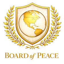
The board of peace logo has become a focal point in discussions about the newly launched Board of Peace, unveiled by former President Donald Trump during the World Economic Forum in Davos. Logos serve as visual shorthand for institutions; critics and supporters alike read symbolism into design choices. In this instance, the emblem’s resemblance to existing international imagery and its apparent geographic focus have amplified scrutiny of the organisation’s stated global ambitions.
Main body: Design, reactions and public files
Unveiling and immediate context
Trump formally inaugurated the Board of Peace in Davos, signing the organisation’s charter as the emblem was revealed. Newsweek reported the debut under the headline noting that the Board of Peace logo “is raising eyebrows,” framing the emblem within broader questions about the initiative’s international reach and legitimacy.
Design similarities and criticisms
Observers have highlighted clear visual parallels between the board of peace logo and the United Nations emblem: both feature a globe framed by olive branches. Commentators point out a key difference in the new design — the globe centres on the United States, with North America prominent while other regions are de-emphasised. On the social platform X, political commentator Adam Schwarz wrote: “Sheesh the full-res version of Trump’s Board of Peace logo somehow looks even worse.” Businessman Arnaud Bertrand posted: “Beyond parody: Trump’s ‘Board of Peace’ logo is basically the U.N. logo repainted in tacky fake gold and with ‘the world’ reduced to only North America.” These reactions reflect concern that the visual language suggests a narrower, US-focused perspective rather than universal representation.
Public availability of the logo files
The logo has been uploaded to Wikimedia Commons under filenames such as File:Board of Peace logo.png and Board of Peace Logo SVG.svg. Metadata on Commons shows versions and uploads dated 22 January 2026, and notes both raster (PNG) and vector (SVG) formats in circulation on other wikis.
Conclusion: Significance and what to watch
The debate over the board of peace logo is more than aesthetic; it touches on perception, diplomatic symbolism and the credibility of a body presented as having international ambitions. Readers should watch whether the Board of Peace responds to design criticism, adapts its branding, or clarifies its membership and mission. How the organisation addresses these questions may influence whether its visual identity supports — or undermines — its stated global objectives.


